Designing component behaviours for accessibility text sizes
Making larger text sizes a first-class component constraint
Some legacy components in the Deezer Design System looked stable at default text size, but became fragile once users increased their accessibility settings.
The work covered both existing and new components: reviewing legacy behaviours when accessibility issues appeared, and defining clearer guidelines so larger text sizes could be considered earlier in new component decisions.
Problem
Beyond the visual issues, the main problem was the experience created for users who rely on larger text. Some components were still protecting their default shape instead of adapting to the user's settings, which could make content harder to read, partially hidden, or missing from the interface.

This happened in components that had been designed around stable default conditions. At larger text sizes, labels, metadata, and actions needed more space than the layout could absorb. Some content was truncated earlier than expected, some areas became visually compressed, and some horizontal structures no longer held correctly.

The Design System also lacked clear guidelines on how components should behave with larger text sizes. Accessibility scale was often checked too late in the process, once the default layout had already been designed and the component behaviour was harder to adjust.
Component behaviour rules
We reviewed the component patterns most likely to break with larger text sizes: max lines, fixed heights, and dense horizontal layouts. We translated these issues into a set of rules for both legacy and new components.
Don't use max lines as a default layout solution.
When the content is controlled, define character recommendations and let the component adapt to the user's font size.
Use max lines when the content cannot be controlled.
For music metadata, user-generated content, truncation is still necessary. In those cases, the user still needs another way to access the full content.
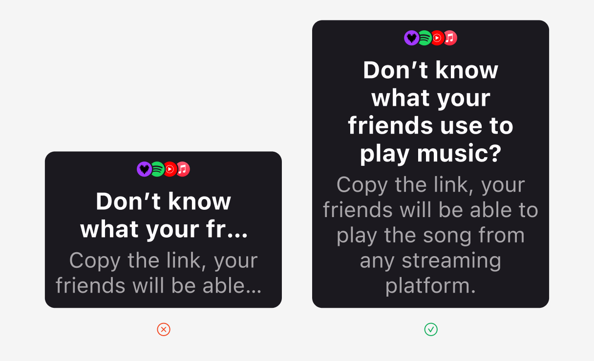
Define accessibility breakpoints when the layout no longer works.
Some components need to change structure at larger text sizes instead of forcing the same layout to survive.
Avoid fixed heights when text can scale.
A component should not preserve its shape by hiding, compressing, or cutting information.

Design the component behaviour, not only the default state.
The default size is only one case. Accessibility sizes need to be part of the component definition.
Outcome
These rules fed back into Tempo guidelines and component creation.
Legacy components could be reviewed when an accessibility issue appeared, while newer components such as Banner and Cell started to include larger text behaviour earlier in their definition.